Iterative redesign
Written while listening to Tommy Guerrero’s Dusty Dreams.
Over the years, I’ve had people complimenting the design of my website. And while I’m no designer – in the sense that I’ve not practiced design professionally – I studied design some 25 years ago (!!!). That’s what put me onto the path of becoming a stained-glass master.
Despite these compliments, I’ve grown unsatisfied with some aspects of my website:
- I wish I could free myself from the middle narrow-ish column.
- I added so many colors over the years, that it’s impossible to not see that there is no more cohesive color palette.
- I like the readability of the fonts I use, but I find the titles to be overwhelming.
- There are both pastel solid colors and bright gradients in the same pages.
- I’d like to get rid of SASS entirely and only use vanilla CSS (so I put Josh Comeau’s CSS course to use).
- I’ve grown tired of the drawings around the newsletter CTA.
- I find my code blocks so full of inconsistent colors that the code is hard to understand (and it has a lot of contrast problems).
In a word, I’d like it to look sleeker, more cohesive and yet, still retain that hand-crafted feeling.
If you ever worked in design, this is the kind of brief that makes designers shudder. I do not know exactly what I want. I only know I’m vaguely unhappy about it.
I also know that this is typical craftsman dissatisfaction: I see all the tiny things I messed up and these take a disproportionate space in my head.
So, a few weeks ago, I started a branch called redesign-2026 – hoping it would not end up like redesign-2024 and redesign-2025.
My then favorite inspirations were the latest designs of the websites of Naz Hamid and Robin Spielmann.
While I liked the work Robin had done around his layout, I loved the muted and calm vibe of Naz’s color palette.
So I started working by (shamelessly) copying the website of Naz, while knowing I would not be satisfied stopping there. And after a few hours of work, I had something that looked somewhat like Naz’s website, but without either the competency or the finesse of Naz.
I can’t remember the name of the author who wrote that when faced with the blankness of the page, they would start writing another author’s words, then, after a while, their own would follow.
Copying to create momentum. Copying to learn. But never stopping there — copying should only ever be a crutch, a way to get moving until your own voice takes over.
What I find funny, is that while I worked on a redesign, the current result looks so much like my existing website. Sure, the colors are muted, and I’ve cleaned a lot of my CSS mess. But the way the website feels is so close I can tell that there is no need for me to keep agonizing over details (I even outgrew my love for the cream and brown palette in the process).
But my website became, even for a little while, a worry stone. And it helped me refine some semantic HTML, and put my ideas into order.
I also wanted to think about the content I’d like to put forward on my website to better reflect the day-to-day. And the first thing I realized is I should create some of this new content, and adjust the layout of my website when I have enough of this new format to know I can sustain it.
Again, I found some lovely – and completely different – examples on Christopher Butler’s website and Aaron Francis’.
Some of the things I did and I liked that I will port to the main branch:
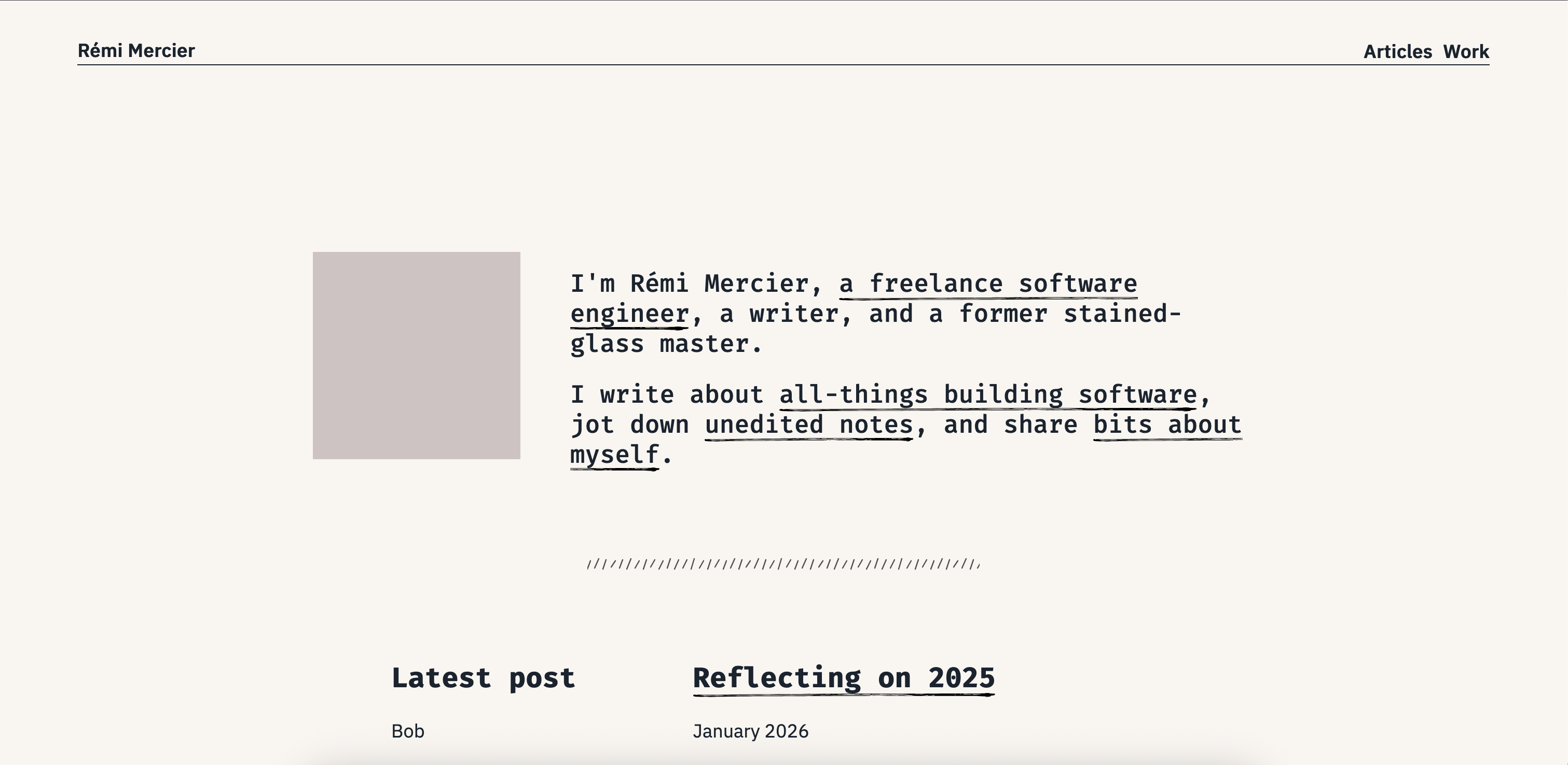
- muted and monochromatic color palette
- some lovely SVG handwritten underlines
- cool code blocks with a vintage-ish Apple look
- smaller headings
- better HTML structure
- better use of the header and the footer
I’ll keep on working on this, but not as full-blown redesign, as big rewrites and I don’t get along that well. But as plenty of small iterations, until I’m satisfied enough with it.
But as to the future of the branch redesign-2026? It might end up like redesign-2024. Collecting dust on a shelf.